Dictapad
Dictapad was a universal iOS app that aided in the transcription of long audio files. It was a snappy text editor with an integrated audio player that offered keyboard shortcuts to adjust playback rate, scrub back and forth and insert timestamps automatically.
First launched for the iPad in August of 2011, Dictapad received regular updates over the years to maintain compatibility and implement new features. More recently, Dictapad underwent a ground-up rewrite in Swift. This update implemented a slew of new features and made the app universal to both iPad and iPhone.
Dictapad version 2 was released as a free update to all existing users in August of 2016, and continued to receive updates through June 2019, when it was discontinued.
History⌗
Dictapad was conceived in the course of transcribing and editing interviews for The Outcomes Project, my master’s report for journalism school. The iPad with an external keyboard was an ideal device for writing, managing photo releases and maintaining the database of participants, but the task of transcribing required a Mac. I dreamed up Dictapad as a tool to help me transcribe on the iPad.
The initial functionality — a text editor with a variable-rate audio player — came together within 24 hours. UI polish and additional functionality came in the weeks that followed; after extensive testing with interviews from the project, it was released to the public in August of 2011. Between 2012 and 2015, Dictapad gained support for new features: AirPrint, Dynamic Type, customizable keyboard shortcuts and Dropbox integration, among others.
Dictapad 2.0⌗
Dictapad saw consistent sales over the years, but by the summer of 2016, the app was beginning to show its age. Dictapad’s core architecture was designed in the iOS 3.2 era and written in Objective-C; the app was failing to take advantage of many modern APIs that would accelerate the pace of development and make it easier to support new device classes.
I decided to rewrite Dictapad from the ground up using Swift in 2016, and to target iOS 9 as the minimum OS version. This meant cleaner support for features like high quality audio stretching, and a modern architecture to support not only iPhones and iPads, but also new multitasking scenarios like Split Screen and Slide Over.
User Interface Design⌗
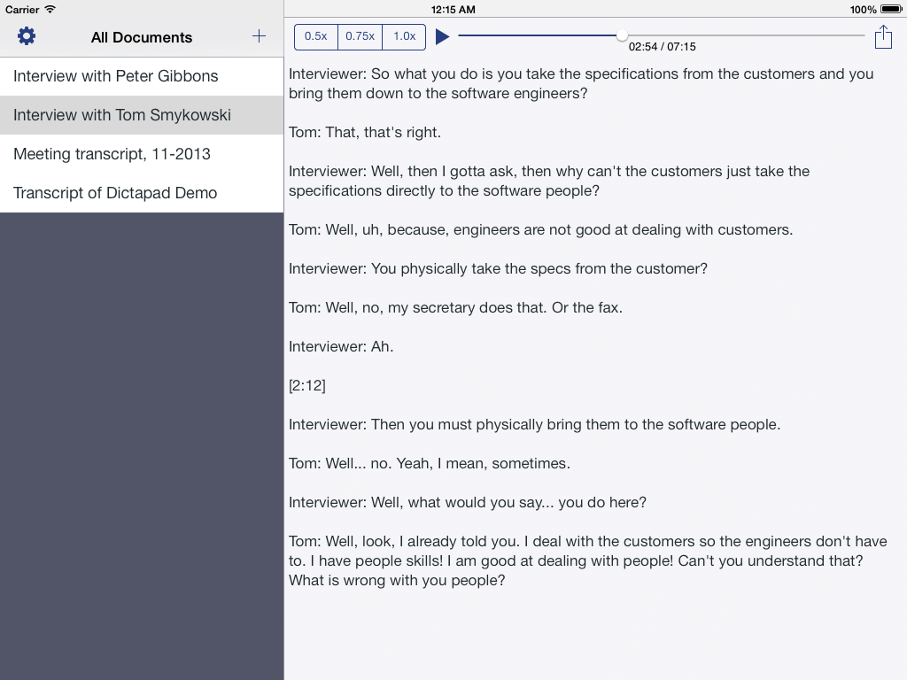
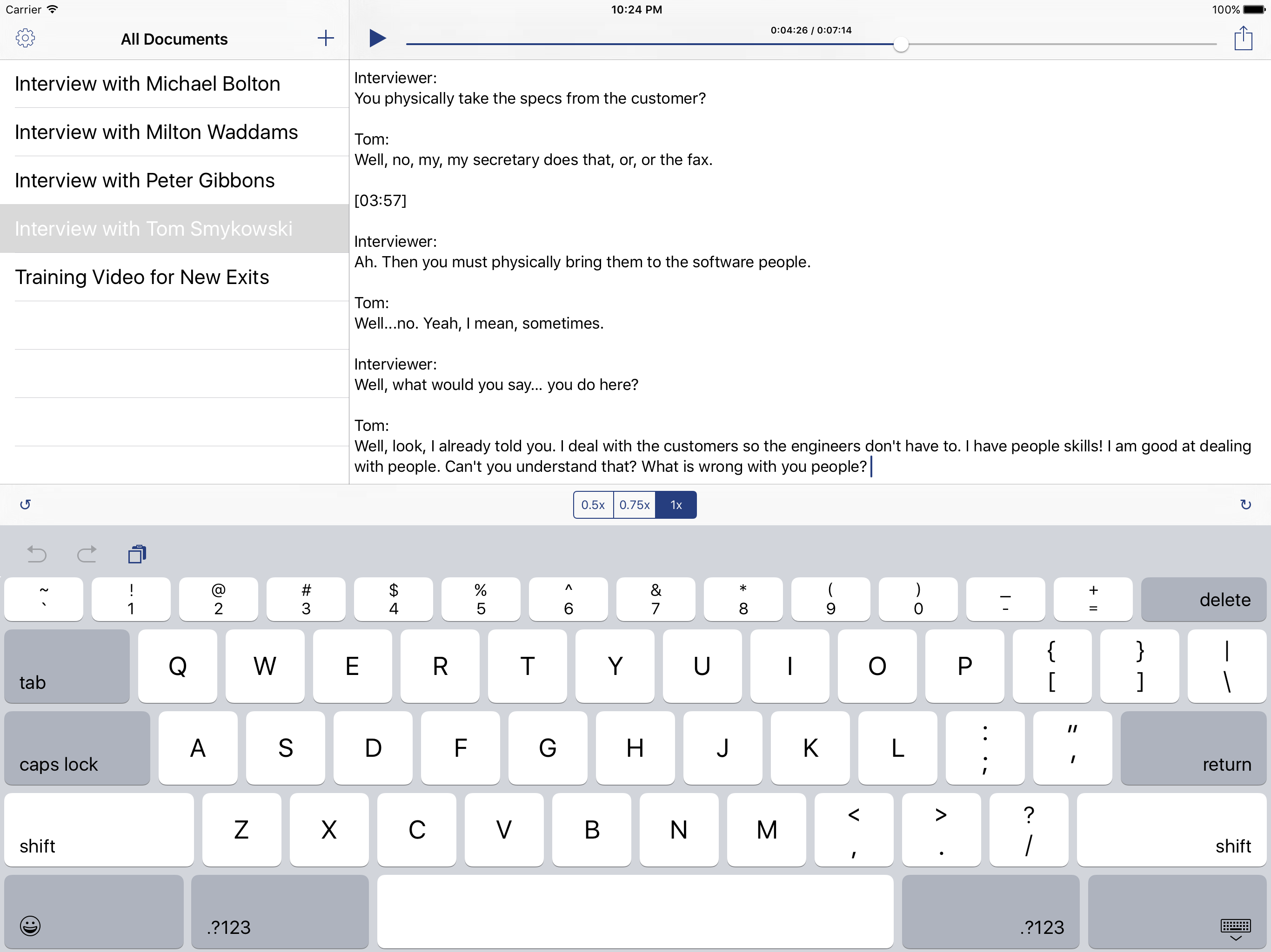
Dictapad uses a split view with a file list on the left and a text editor on the right.
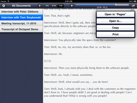
Back in iOS 5 days, the design focused on cool, dark toolbars and navigation bars, and a subtle pinstripe behind the file list. The text editor used the Optima typeface, and featured subtle gray lines over an off-white background.
When iOS 7 arrived, a redesign was undertaken to bring the art direction in line with the flatter feel of the new operating system. In addition, the typography was modified to take advantage of new Dynamic Type technology; this enabled Dictapad to follow the user’s device-wide preferences for fonts and sizes.
By iOS 9, the flat design ethos was in full effect; gone were the shades of gray, and in their place, a crisp black and white design. Only the Dictapad Blue tint marked the app’s few buttons and sliders. In addition, Dictapad 2 made all keyboard shortcut functions available via on-screen controls for the first time. Dictapad had been designed to be best experienced with a keyboard, but making the controls accessible to people without one was a definite usability win.
The Icon⌗
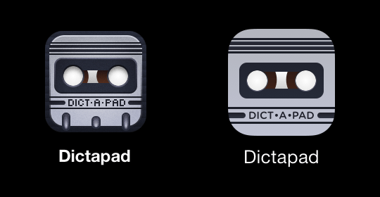
The original design of the icon drew inspiration from classic microcassette tapes that enabled old dictation workflows; the icon was a retro-styled tape cartridge compressed down to a square icon.
With the flatter design ethos of iOS 7-9, the icon was redesigned to maintain the same character, but with fewer of the skeuomorphic cues of the original design. Gone were the capstan holes, textured background and faux-grain overlay, along with the pixel art letterforms. In their place: a clean gradient, and a logotype set in the more friendly Gotham Rounded typeface.
The 2016 rewrite also involved designing an icon for a new extension point, the “Transcribe in Dictapad” action. This icon had different requirements: action icons are monochrome, and cannot be full-bleed since iOS places them in a white box.
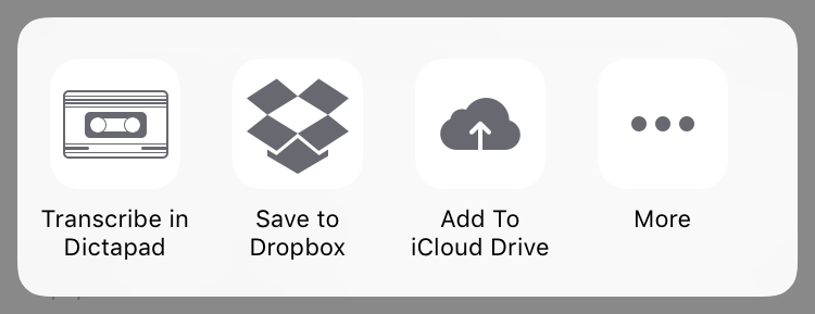
The “Transcribe in Dictapad” icon hearkened back to the design inspiration for the original icon: the microcasette tape. It adopted a rectangular aspect ratio, while maintaining the familiar thick and thin line patterns of the Dictapad app icon. While this icon represented a completely different shape that did not appear elsewhere in the Dictapad experience, it felt of a piece with the rest of the design, which was what the extension icon needed to accomplish.
Technologies⌗
Keyboard Controls⌗
In 2011, the only way to implement keyboard shortcuts was to look for a character the user wanted to type, and interpret that as a command instead. This meant the keyboard shortcuts had to be printable characters, and Dictapad initially settled on the accent key, the backslash, the tilde and the pipe ( ` \ ~ |) to scrub back, scrub forward, slow down and speed up playback, respectively. Their positions at the far left and far right of the keyboard made them natural spots for these shortcut actions.
In modern iOS, the UIKeyCommand API makes first-class keyboard shortcuts a reality, and Dictapad 2 takes advantage of this: the modern keyboard shortcuts are Control + Left / Right / Up / Down.
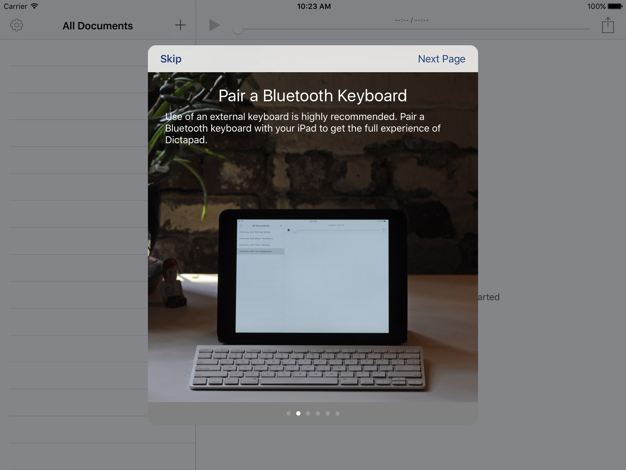
To avoid impacting existing users’ workflows, an option was added to preserve the legacy keyboard shortcuts. This option was automatically enabled for users upgrading from Dictapad 1, while users new to Dictapad 2 got the modern shortcuts by default. In addition, a new onboarding screen educated users about the new options available to them in Dictapad 2.
Workflow Integration⌗
Dictapad was a simple tool meant to fit snugly into a larger workflow. To this end, it had to be dead simple to get audio in, and get documents out.
Dictapad 2 added a “Transcribe in Dictapad” extension point for importing voice notes directly into the app. You could also AirDrop files to Dictapad from an iPhone, iPad or even a Mac. It supported Dropbox, iTunes File Sharing and import from the iPad’s music library, as well as from any app that used the iOS standard sharing sheet. This meant that from the iPad’s mail app and a number of iPad voice recorders, getting audio into Dictapad was as simple as tapping your audio file and selecting Dictapad from the resulting list of apps.
Dictapad also supported getting your transcriptions out quickly and easily. Dictapad used the iOS document interaction API to offer a text file to Notes, Pages, PlainText, Byword, or your favorite iPad text editor.
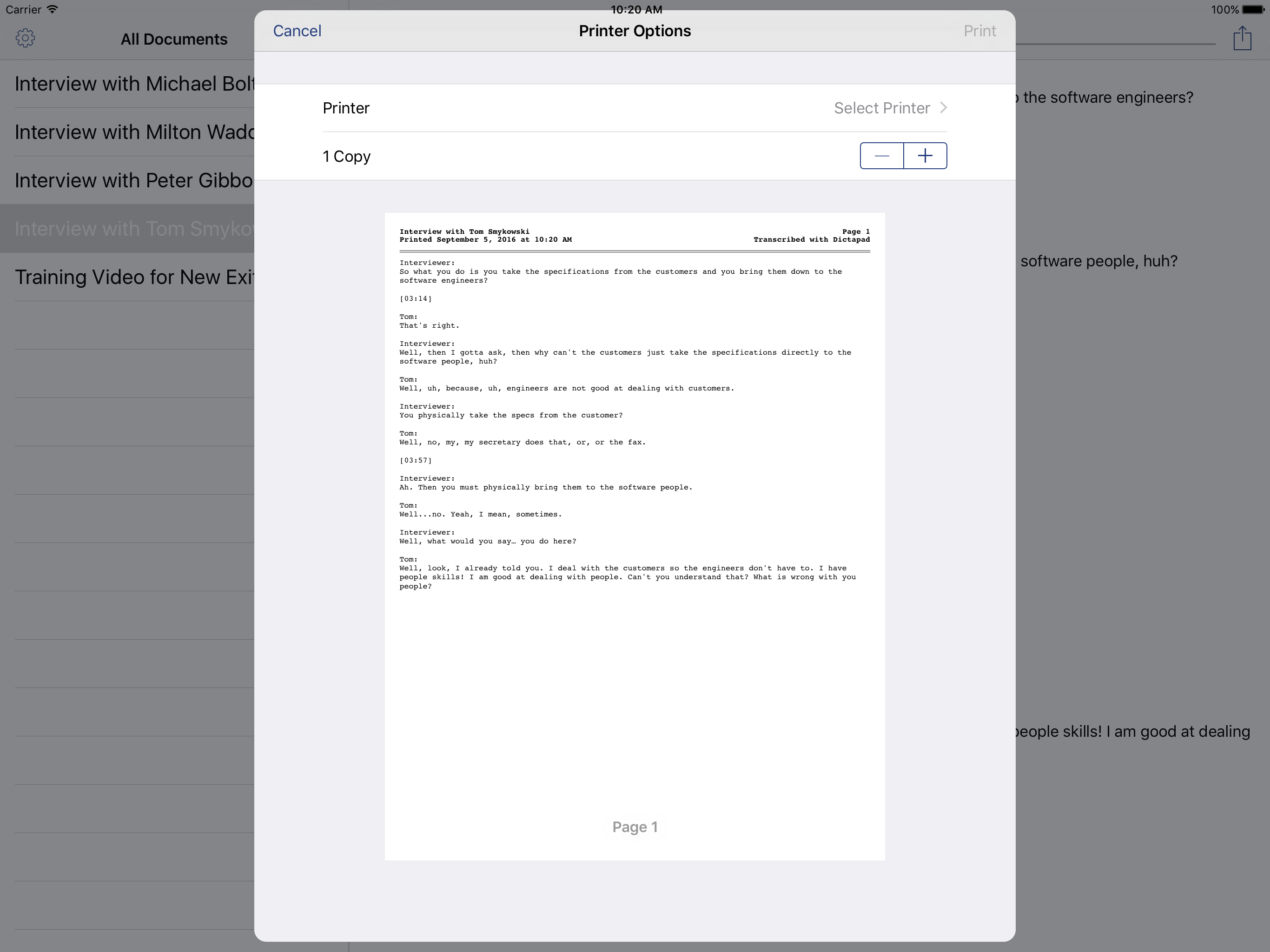
Printing was a natural feature for a document-based app, and Dictapad was no slouch here. Dictapad’s printouts were clean and well designed, going above and beyond what most iPad text editors offered. Printouts included page numbers and other basic information in a header on each page. They also offered space for custom header text, such as a project name or a copyright notice, that could be changed in Settings.
Conclusions⌗
This is by far the longest app writeup on my website, but it was also the longest-running app I had on the App Store. Dictapad is a good example of the evolution of a utility application on the App Store: evolving with the times, publishing compatibility updates, implementing features, and eventually paying down technical debt. The 2016 release of Dictapad 2.0 — published five years to the day after its introduction — was a solid foundation for the future of Dictapad, and gave the app another three years of life before slow sales made continued development unsustainable.
I was sad to see it go.